A moody bedroom already carries a sense of drama on its own, but how that drama is actually achieved depends on far more than simply painting the walls a dark color. Choosing dark paint is only the starting point — what separates a bedroom that feels intentionally moody from one that feels merely dim is how color, lighting, texture, and layout are all coordinated to work together rather than existing as a series of disconnected decisions.
Getting that coordination right depends on a few factors: how deep and consistent the color palette is across the room, how lighting is layered to keep a dark room from feeling flat or cave-like, and how texture is used to add depth where color alone can’t carry the space. A dark room with mismatched lighting and bare walls reads very differently than the same room finished with layered lighting and a cohesive material palette, even though both technically qualify as “moody.” Here are fifteen approaches worth knowing, along with what makes each one distinct.
It’s also worth thinking of color, lighting, and texture as three separate design decisions that need to work in conversation with each other, rather than one automatically following from the other. The same deep wall color can look completely different depending on whether it’s paired with warm, layered lighting and rich textiles, or a single harsh overhead bulb and bare surfaces, and choosing all three together — rather than picking a paint color first and addressing lighting and texture as an afterthought — tends to produce a far more atmospheric, restful result.
1. Deep Charcoal Walls With Warm Wood Tones

A charcoal or near-black wall color, paired with warm wood furniture and flooring, keeps a dark room from feeling cold or sterile, since the warmth in the wood counterbalances how stark deep charcoal can read on its own.
Because charcoal walls absorb rather than reflect light, this approach depends on layered lighting to prevent the room from feeling underlit, particularly in bedrooms with limited natural light to begin with. Choosing a wood tone on the warmer end of the spectrum, rather than a cool gray-washed finish, helps maintain the balance this pairing relies on.
2. Deep Green Walls With Brass Accents

A deep forest or hunter green wall color paired with brass hardware, light fixtures, and small accents introduces a sense of richness and depth that reads as intentional rather than simply dark, since the metallic warmth of brass keeps the green from feeling flat.
This combination works particularly well in bedrooms with some natural light, since deep green can appear almost black in very dim conditions, muting the color’s distinct character. Mixing matte and slightly polished brass finishes across different accents helps prevent the metal accents from reading as too uniform or catalog-like.
3. Navy or Deep Blue Walls With Layered Neutrals

Navy or a deep midnight blue on the walls, paired with layered neutral bedding and furniture in cream, taupe, or soft gray, creates a moody effect that still reads as calm and restful rather than heavy, which suits bedrooms meant primarily for sleep rather than dramatic visual impact.
This pairing depends on keeping the neutral layer genuinely layered — several shades and textures of neutral rather than one flat tone — since a single neutral against navy walls can look under-furnished by comparison. Adding one warm metallic or wood accent within the neutral layer keeps the combination from feeling entirely cool-toned.
4. Black Accent Wall Behind the Bed

Painting a single wall — typically the one behind the headboard — in black or a near-black shade gives the bedroom a strong focal point and a sense of drama without requiring the same commitment across the entire room, which makes this approach more reversible than fully painting a room dark.
The remaining walls should stay in a complementary but lighter tone in comparison, since a fully black room paired with an equally dark accent can lose the contrast that makes the accent wall function as a focal point in the first place. Positioning the bed’s headboard to align with the accent wall’s width, rather than off-center, keeps the visual weight balanced.
5. Layered Warm Lighting Instead of a Single Overhead Fixture

Relying on multiple lower, warmer light sources — bedside lamps, a floor lamp in a corner, string lights along a headboard — rather than a single central overhead fixture keeps a dark, moody bedroom from feeling flat or poorly lit, since layered lighting creates depth and shadow rather than one uniform wash of light.
This approach depends on choosing warm-toned bulbs consistently across every fixture, since mixing warm and cool light temperatures in a dark room reads as inconsistent rather than intentional. Installing dimmers on the primary sources allows the room’s mood to shift between a brighter reading light and a dimmer, more atmospheric evening setting.
6. Rich Velvet Textiles Throughout

Incorporating velvet through a headboard, throw pillows, or a bench at the foot of the bed adds a tactile richness that pairs particularly well with deep wall colors, since velvet’s light-catching texture keeps dark surfaces from reading as visually flat.
Because velvet shows wear and pressed marks more visibly than other fabrics, choosing a higher-quality weave for pieces that get frequent contact, like a headboard or bench, helps the texture hold up better over time than a lower-cost alternative. Mixing velvet with one or two other textures — linen bedding, a leather accent chair — keeps the room from feeling one-dimensional in material alone.
7. Dark Wood Furniture With Matte Black Hardware

Furnishing the room with dark wood pieces — a walnut or espresso-toned dresser, nightstands, a bed frame — paired consistently with matte black hardware creates a unified material base that reinforces the moody palette without relying on wall color alone to carry the mood.
This approach requires planning furniture purchases with the existing material palette in mind, rather than buying pieces independently based on individual appeal, since mismatched wood tones can undercut the cohesion this combination depends on. Bringing a small wood sample when shopping for additional furniture helps ensure new pieces actually match the established tone.
8. Moody Floral or Botanical Wallpaper

A wallpaper featuring dark botanical or floral patterns — deep greens and blacks with occasional jewel-toned accents — introduces pattern and visual interest while still maintaining the overall depth and richness a moody bedroom relies on, rather than lightening the room the way a pale floral pattern would.
This approach works best when applied to a single wall or a smaller space, like a nook or the wall behind a headboard, since a fully wallpapered room in a dense dark pattern can feel overwhelming in a smaller bedroom. Keeping the surrounding furniture and bedding simpler in comparison prevents the pattern from competing with too many other visual elements.
9. A Canopy or Draped Bed Frame

A canopy bed frame, or curtains draped from a ceiling-mounted rod above the bed, adds a sense of enclosure and intimacy that reinforces a moody atmosphere, particularly in bedrooms with higher ceilings where the extra vertical element helps fill the space.
This approach depends on choosing fabric weight appropriate to the effect intended — sheer fabric softens the room while still allowing light through, while a heavier fabric creates a more enclosed, dramatic feel. Securing the canopy structure properly to the ceiling or bed frame matters more here than with purely decorative elements, since the fabric needs to hold its shape without sagging over time.
10. Dark Bedding With Metallic or Jewel-Toned Accents
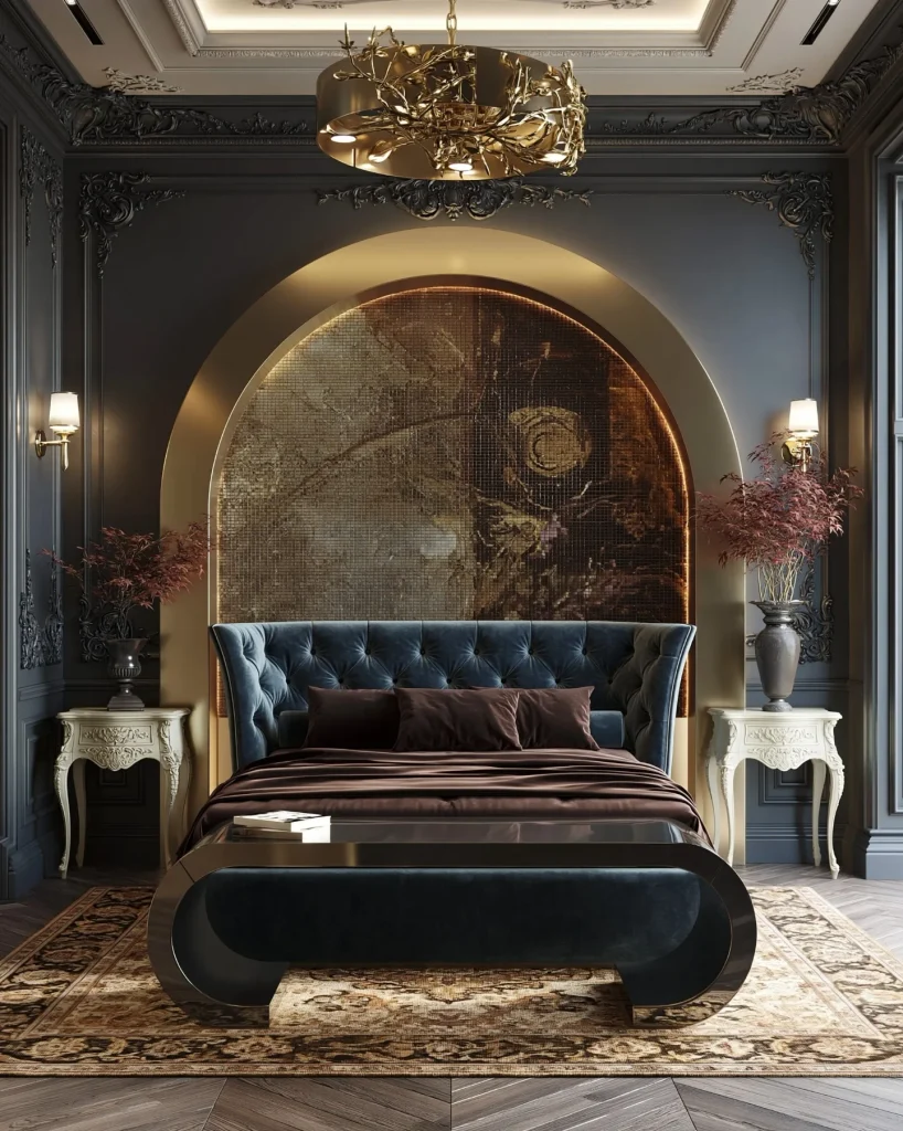
Choosing bedding in deep charcoal, black, or espresso tones, then layering in one or two accent pillows or a throw in a jewel tone or metallic finish, keeps the bed itself feeling intentional and layered rather than uniformly flat in a single dark color.
This approach pairs especially well with a mix of textures within the bedding itself, since a single flat dark color across every layer can look less considered than the same palette expressed through varied fabrics. Washing and rotating bedding regularly, despite the darker color palette, helps maintain a fresh appearance that dark tones can sometimes make harder to visually assess.
11. Dim, Warm-Toned Wall Sconces Flanking the Bed

Wall-mounted sconces on either side of the bed, rather than table lamps taking up nightstand space, provide functional reading light while contributing to the layered lighting a moody bedroom depends on, and their fixed position keeps the nightstands clearer for other styling.
This approach requires planning electrical wiring in advance if hardwired sconces are used, since retrofitting wiring after a room is finished is more disruptive than including it during an initial renovation or using plug-in sconce alternatives instead. Choosing sconces with an adjustable arm or shade angle allows the light to be directed for reading without illuminating the entire room.
12. Dark-Framed Art in a Cohesive Collection

A collection of framed art — moody landscapes, abstract pieces, black-and-white photography — hung together in dark or black frames reinforces the room’s overall palette while adding a personal, curated layer that plain walls alone don’t provide.
Planning the arrangement’s spacing before hanging, and keeping a consistent gap of a few inches between frames, helps the collection read as intentional rather than randomly placed. Choosing frames in a consistent finish, even if the art itself varies in subject or style, keeps the wall feeling cohesive with the rest of the room’s dark material palette.
13. A Single Oversized Statement Light Fixture

Choosing one striking pendant or fixture — an oversized dome shade, a sculptural chandelier — as a central feature gives the moody bedroom a clear focal point, functioning similarly to a statement piece in a minimalist room but suited to the darker, richer palette here instead.
This approach works best when the rest of the room’s furniture and decor stay relatively simple, so the statement fixture doesn’t have to compete with several other bold choices for attention. Positioning the fixture to hang low enough to feel intimate over a seating area or the bed, without obstructing movement or sightlines, gets the most visual impact from its placement.
14. Textured Plaster or Limewash Walls

A limewash or textured plaster wall finish, rather than flat paint, adds subtle variation and depth to a dark wall color, since the slightly uneven, matte texture catches light differently across the surface compared to a single flat coat of paint.
This approach requires more specialized application than standard paint, so budgeting for either professional application or additional practice time if attempting it as a project matters more here than with a straightforward paint job. Applying the finish in a well-ventilated space and allowing adequate curing time helps the texture set properly before furniture is moved back into the room.
15. Seasonal Refresh Through Textiles Rather Than Structural Change

Rather than repainting or replacing furniture to keep a moody bedroom feeling fresh, rotating in seasonal textiles — a heavier wool throw and darker jewel-toned pillows in colder months, lighter linen accents in warmer ones — allows the room’s atmosphere to shift subtly without disrupting the underlying palette.
This approach benefits from keeping a small, defined set of seasonal textiles on hand, rather than accumulating pieces that no longer fit the room’s cohesive material and color palette over time. Reassessing the room every few months, similar to a seasonal check-in in other rooms of the house, helps catch any drift toward a busier or less considered look before it accumulates.
Choosing and Maintaining a Cohesive Moody Bedroom
With fifteen distinct approaches to consider, a few practical principles help identify which combination will actually suit a specific room, amount of natural light, and long-term maintenance capacity.
Natural light should guide which approaches matter most. A bedroom with ample daylight can support a fully dark, saturated palette without feeling oppressive, while a room with limited natural light may benefit more from a single accent wall or darker furniture paired with lighter walls, so the space doesn’t lose all sense of openness. Trying to apply the deepest, darkest version of every approach equally to a naturally dim room often produces a heavier result than balancing dark elements against the room’s actual light conditions.
Lighting planning affects how successfully a dark palette reads day to day. A room with only a single overhead fixture will struggle to feel intentional no matter how well-chosen the wall color and furniture are, so establishing a layered lighting plan — several warm, lower sources rather than one central light — early in the process tends to matter more than any individual color or material decision made afterward.
Maintenance and texture choices deserve real consideration before committing to a particular material palette, since some approaches — velvet upholstery, limewash walls, canopy drapery — require more careful upkeep than a straightforward paint-and-furniture combination. Choosing an approach that realistically matches the time and budget available for both installation and ongoing care keeps a moody bedroom looking intentional rather than gradually worn or mismatched.
Finally, building a moody bedroom is generally more successful when treated as a layered process rather than a single dramatic paint change. Starting with the wall color or a defining dark element, planning lighting around it early, and layering in texture and considered decor afterward allows the underlying principles — depth, warmth, and intentional contrast — to come together as a cohesive whole rather than a dark room that simply reads as underlit.
Being specific about how much natural light the room actually gets, how the lighting plan will support the palette after dark, and which one or two materials will anchor the room’s texture helps translate a general goal like “moody bedroom” into the precise combination of choices described above. Because small differences in lighting, texture, and color depth produce such different overall results, that extra bit of specificity at the planning stage is often what separates a bedroom that feels genuinely atmospheric from one that simply looks dim.