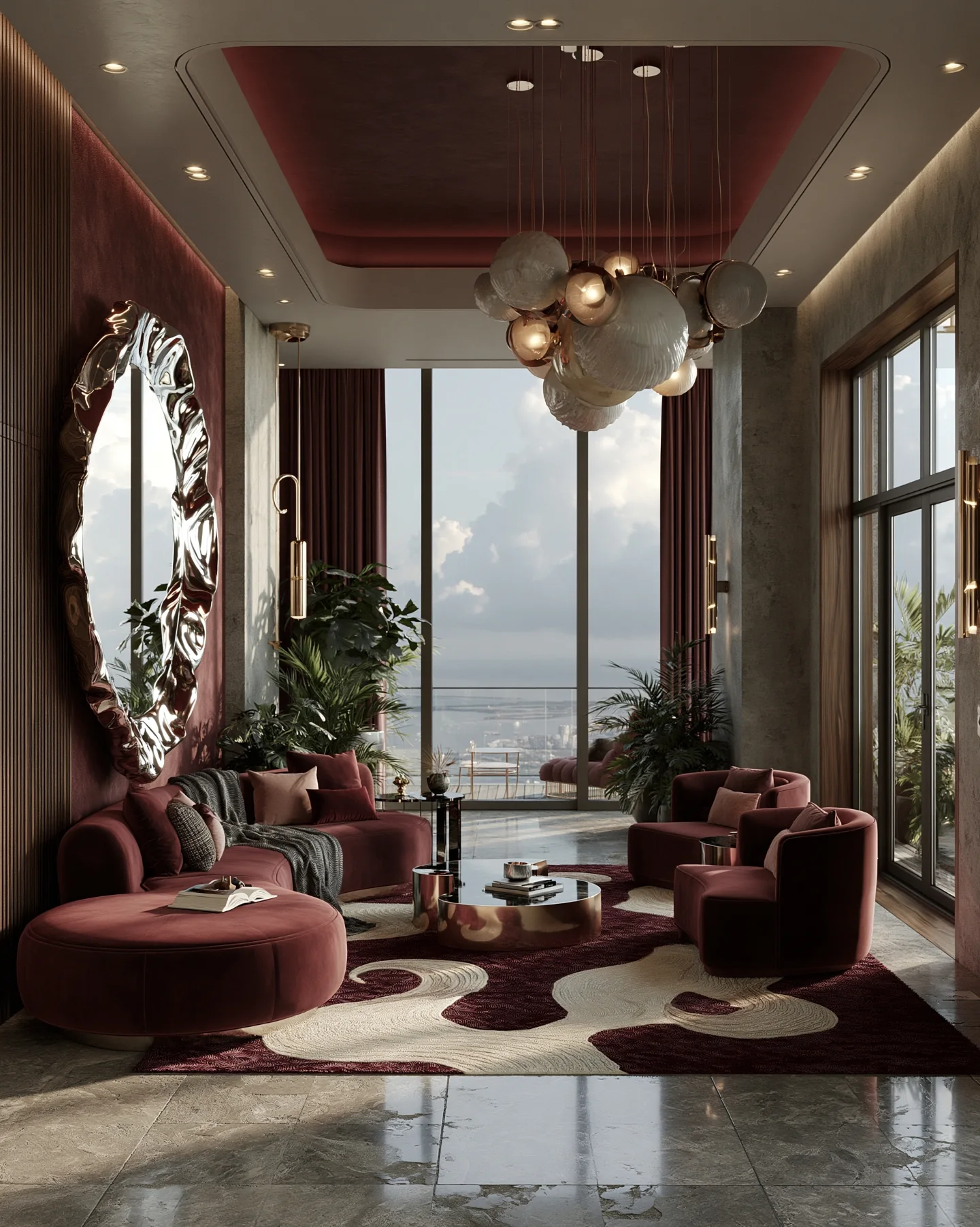
Burgundy has outlasted most other deep-color trends in living room design, and there’s a simple reason for it. Unlike a bright jewel tone, which can date quickly or feel overwhelming in a large space, burgundy sits close enough to neutral browns and reds that it blends into almost any room without forcing a full redesign. It reads as warm rather than cold, formal rather than casual, and it works in both small apartments and large open-plan spaces without losing its character.
The fourteen ideas below cover the full range, from a single accent piece to a fully committed burgundy room. Each one notes the room size and existing style it suits most, along with the material or technique that keeps it looking intentional rather than heavy-handed.
Burgundy Accent Wall: The Original Entry Point

A burgundy accent wall paints just one wall in the room — usually the one behind the sofa or fireplace — while the remaining walls stay a lighter neutral. This is the approach most people try first, and it remains the most universally flattering version in the category, mostly because a single wall doesn’t compete with furniture, art, or natural light the way a fully painted room can.
Living rooms with strong architectural focal points suit it best, since the wall naturally draws attention to a fireplace, built-in shelving, or a large window without extra effort. It works particularly well in rooms with high ceilings, because the depth of the color doesn’t shrink the space the way it might in a smaller, boxier room. A matte or eggshell finish applied with a roller, rather than a glossier sheen, is what keeps the wall looking rich rather than reflective under overhead lighting.
Burgundy Velvet Sofa: More Texture, More Statement

A burgundy velvet sofa becomes the anchor of the room rather than a supporting piece, with the rest of the furniture and walls kept intentionally neutral around it. The effect is softer and more luxurious than a painted wall, since velvet catches light differently depending on the angle it’s viewed from, which gives the color noticeably more depth in person than in photos.
This is the safer entry point for anyone nervous about a fully committed burgundy room looking too dark. Because the sofa is a single, movable piece, the overall look can be adjusted later just by changing cushions or a throw rather than repainting. It suits nearly every room layout, though open-plan living rooms benefit most from the sofa acting as a clear visual anchor. A fabric protector applied before regular use, followed by routine vacuuming with an upholstery attachment, keeps the velvet looking full and rich rather than flattened.
Burgundy and Gold Accents: Detail That Elevates the Whole Room

Pairing burgundy with gold or brass accents — in lamps, picture frames, or drawer pulls — makes the room read as far more polished than the effort it actually takes. The metallics do double duty here, adding warmth that keeps burgundy from feeling too heavy, and catching light in a way that plain neutral accents don’t.
Balance is the detail that decides the whole result. The gold needs to appear in at least two or three places around the room, or it reads as a single mismatched accessory rather than an intentional pairing. Choose warm-toned brass or antique gold rather than bright, polished gold, since the warmer finish sits more naturally against a deep red than a cooler metallic does. Rooms with existing wood furniture hold this combination especially well, because the wood tones bridge the burgundy and gold without needing extra styling.
Burgundy Curtains: A Softer Alternative to Painted Walls
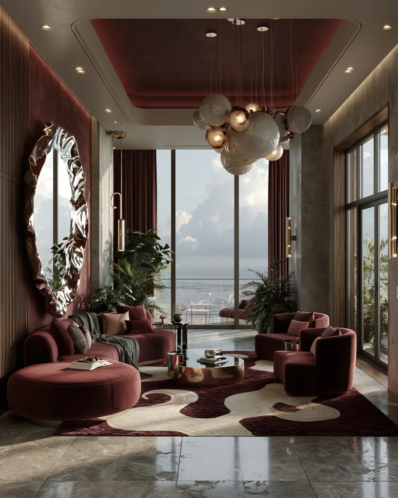
Burgundy curtains bring the color into the room through fabric rather than paint, creating a softer, more adjustable version of the same effect. The curtains give the room depth and warmth without the commitment of covering the walls, which makes the style easy to change later if the color eventually feels too dark.
This version works particularly well for rooms with plenty of natural light, since the light filtering through the fabric softens the tone rather than letting it sit flat and heavy. A medium-weight linen or velvet, rather than a sheer or very lightweight fabric, keeps the color looking full instead of washed out. Living rooms with white or light grey walls suit it especially well, since the contrast lets the curtains read as a clear, deliberate statement.
Burgundy Rug: Old-Money Grounding for the Whole Space

A burgundy area rug anchors the room from the floor up, tying together furniture and wall colors that might otherwise feel disconnected. The look is deliberately traditional, and it works best when the rug’s pattern is kept relatively simple, since the color itself is already doing most of the visual work.
Choosing the right rug requires attention to the room’s existing wood tones, since a rug with cool undertones can clash with warm oak or walnut furniture even when the burgundy itself looks correct in isolation. A wool or wool-blend rug, rather than synthetic fibers, is what allows the color to age well and resist flattening under heavy foot traffic. This is the option most suited to living rooms with light or neutral flooring, since darker existing floors tend to compete with the rug rather than let it stand out.
Burgundy and Emerald Combination: Rich, Layered Color Pairing

Combining burgundy with deep emerald green — through cushions, art, or a second accent wall — creates a richer, more layered look than burgundy used on its own. The pairing is deliberately maximalist, and it demands more confidence than almost any other idea on this list, since both colors are strong enough that getting the balance wrong makes the room feel cluttered rather than curated.
Keeping one color dominant and the other as a secondary accent is what allows the pairing to work. A room painted primarily in burgundy with emerald introduced only through smaller pieces, like cushions or a single armchair, reads as intentional rather than competing. This combination suits larger rooms with good natural light best, since smaller or darker rooms can feel overwhelmed by two saturated colors at once.
Burgundy Leather Armchair: A Classic Study-Room Feel

A burgundy leather armchair, placed as a single statement piece rather than part of a matching set, brings a study or library feel into a living room without requiring the rest of the furniture to match. The leather ages differently from fabric, developing a slightly lighter, worn patina over time that fabric upholstery doesn’t.
This piece works particularly well alongside existing brown or tan leather furniture, since the tones share enough warmth to feel coordinated without being identical. A leather conditioner applied every few months, rather than left untreated, keeps the surface from drying out and cracking with regular use. Rooms with wood-paneled walls or built-in bookshelves suit this idea especially well, since the traditional materials reinforce the same warm, classic mood.
Burgundy Accent Cushions: The Most Common Entry Point

Burgundy cushions scattered across a neutral sofa remain one of the most common ways people introduce the color, precisely because they split the difference between a full commitment and no color at all. This approach keeps the base furniture flexible while still giving the room a clear seasonal or stylistic focal point.
It suits nearly every sofa color, though it pairs particularly well with cream, grey, or camel upholstery, since the contrast lets the burgundy stand out clearly rather than blending in. Mixing two or three different textures — velvet, boucle, and a woven pattern, for example — rather than matching cushions exactly, keeps the styling looking layered instead of uniform. This is the version most forgiving of a rented space, since cushions can be swapped out entirely without any wall or furniture changes.
Burgundy Fireplace Surround: A Focal Point Built Into the Architecture
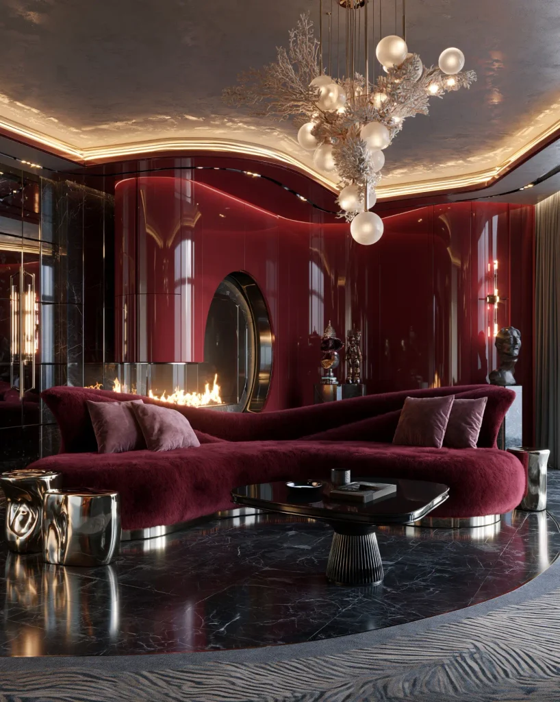
Painting or tiling a fireplace surround in burgundy turns an existing architectural feature into the room’s clear focal point, rather than adding a new element to compete with it. The color works especially well here because a fireplace already draws the eye, and the deep tone reinforces that focus rather than fighting it.
This idea needs the surrounding wall color kept notably lighter, since a burgundy fireplace against an already dark wall loses its definition and can make the whole area feel like a single dark mass. A heat-resistant paint or specialty tile, rather than standard wall paint, is necessary for any surface close enough to the fire to experience regular heat exposure. Living rooms built around a central fireplace suit this look particularly well, since the color reinforces a focal point the room’s layout already establishes.
Burgundy and Blush Combination: Softer, More Feminine Pairing

Pairing burgundy with soft blush pink — through cushions, a single upholstered chair, or wall art — creates a noticeably softer, warmer version of a burgundy room than pairing it with darker or more saturated colors. The blush tones down the intensity of the burgundy without diluting it, which keeps the room feeling deep rather than pastel.
This combination suits smaller or more intimate living rooms particularly well, since the softer secondary color prevents the space from feeling too heavy despite the dark base tone. Introducing the blush through soft, matte-finish materials — cotton or brushed velvet, rather than anything glossy — keeps the pairing feeling cohesive rather than mismatched. Rooms with plenty of white trim or millwork hold this combination especially well, since the crisp white breaks up the two warm tones and keeps the palette from feeling flat.
Fully Burgundy Room: Bold and Fully Committed

A fully burgundy room paints the walls, upholsters the main seating, and often extends the color into curtains or a rug as well, committing to the tone throughout rather than using it as an accent. This is the boldest option on this list, since there’s no neutral base to fall back on, and it depends entirely on lighting and texture variation to keep the space from feeling flat or cave-like.
Layering multiple textures — a matte wall, a velvet sofa, a woven rug — is what prevents a single-color room from looking one-dimensional. Adequate lighting matters more here than in any other idea, since a room without enough natural or artificial light will read as dark and closed-in rather than rich and warm. This look pairs especially well with high ceilings and large windows, since the extra light and volume keep the deep color from overwhelming the space.
Burgundy Bookshelves and Trim: Detail Without Full Commitment

Painting bookshelves, trim, or a single built-in unit in burgundy, while keeping the main walls a lighter neutral, brings the color into the architecture of the room without covering the largest surfaces. This approach reads as more considered and designer-led than a full accent wall, since it treats the color as a finishing detail rather than a background choice.
A semi-gloss finish, rather than fully matte, is worth using on trim and shelving specifically, since the slight sheen helps the woodwork read as distinct from the wall color around it. This idea works particularly well in rooms with existing built-in shelving, since it upgrades a feature that’s already there rather than requiring new furniture or paint across the whole room.
Burgundy Wallpaper: Pattern and Depth Together

Burgundy wallpaper, whether in a subtle textured print or a bolder botanical pattern, adds the color along with visual depth that flat paint can’t replicate. The pattern does more of the work than the color alone, which makes this option feel less severe than a solid burgundy wall even though it covers the same amount of surface.
Choosing a paper with some sheen or metallic thread, rather than fully matte, helps the pattern catch light and avoid looking flat under standard room lighting. This works especially well as a single-wall treatment in a smaller room, since a full room of patterned wallpaper in a deep color can feel busy rather than intentional. Living rooms with simple, unpatterned furniture suit it particularly well, since the wallpaper becomes the room’s main visual detail rather than competing with a patterned sofa or rug.
Choosing the Right Materials for a Burgundy Living Room
Material choice matters more in a burgundy living room than in most lighter color schemes, since the depth of the color changes noticeably depending on what it’s applied to and how much light hits it.
A matte or eggshell paint finish is worth prioritizing for walls, since gloss finishes tend to make the color look harsher and more reflective under overhead lighting than the softer tone most people are aiming for. Velvet and wool suit burgundy furniture and rugs particularly well, since both materials absorb rather than reflect light, which keeps the color looking rich instead of flat. Warm-toned wood furniture — oak, walnut, or mahogany — pairs more naturally with burgundy than cooler-toned woods like ash or pine, since the warmth in both elements reinforces rather than competes with each other.
Lighting carries as much weight as material choice. Rooms relying mostly on warm, ambient lighting rather than harsh overhead fixtures let burgundy read as rich and inviting rather than dark and closed-in. Testing a paint sample or fabric swatch under the room’s actual lighting, both during the day and in the evening, is the step most people skip and the one most likely to prevent an unwelcome surprise once a full wall or piece of furniture is committed to the color.